Before any project we do a thorough study of the client’s backgrounds, their beliefs, habits, their current lifestyle and the envisioned lifestyle. The clients consisted of a family of four, two unmarried sons, the father and the mother. They were deeply rooted in Jainsim and insisted that we consider Vastu for the planning including the WC positions for the bathrooms.We believe that a well defined and well detailed space in accordance with the site context, the habits, the sun path etc are the best “vastu” spaces. It is illogical that a builder could plan 2-4 units along with the WC directions on a floor plate with all of them in accordance with Vastu.But design has a solution to everything. We insisted on a few structural changes. There were a lot of beams and offsets that needed to be cleared away. The builders consider the bathroom to be a service area and we had the most horrible offsets for all the bathrooms which needed to be cleared away keeping in mind the services and the already concealed AC piping.Design becomes a very easy job once these unwanted offsets are cleared away and the designer gets a clean space to work with.Beyond this, good detailing and resolving the functions required in the space was the next step.We decided that there would be a minimal material palette for the project and we would explore how we can push the materials we have used in terms for forms, details, sections and shapes.Yet, every room had to have its identity. A cohesive identity and yet nuances of various materials enhancing and identifying every space and co-relating it to it’s user.

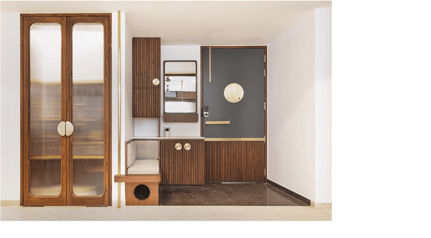
The entrance area was thought of as per the functions that it should cater to.Entering the house, leaving the keys, having a spot to sit and remove your shoes, or to count clothes if the Dhobi would be there, accommodating the MCB and service-related items.We created elements that would be cohesive in the forms and would create a good back drop if you are viewing the entrance from the living room and vice-versa.The existing Mandir space was retained. We did a separate study on how the clients utilise the Mandir, how the Puja is done, what their concepts are. Based on this we created an elevation, a space for all the idols in the way that they are to be worshipped. The idea was to not have a random Mandir in marble made by some Sompura put up in the space. It was to organize the act of “worship”. We made sure that we used a certain type of wood for all the pedestals for the gods which is considered to be auspicious in Jainism. This automatically defined the platforms where we were to place the idols.

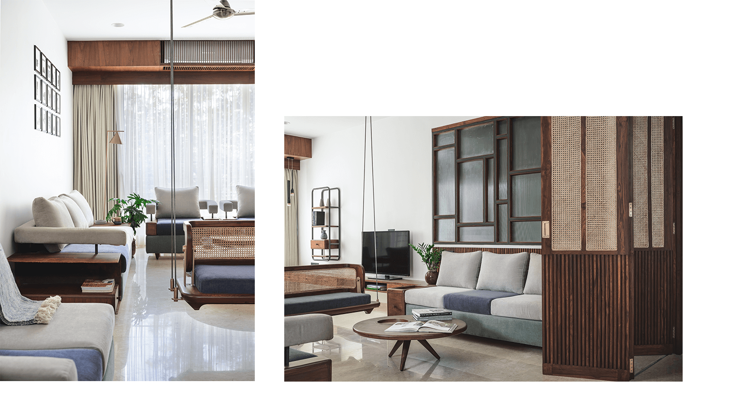
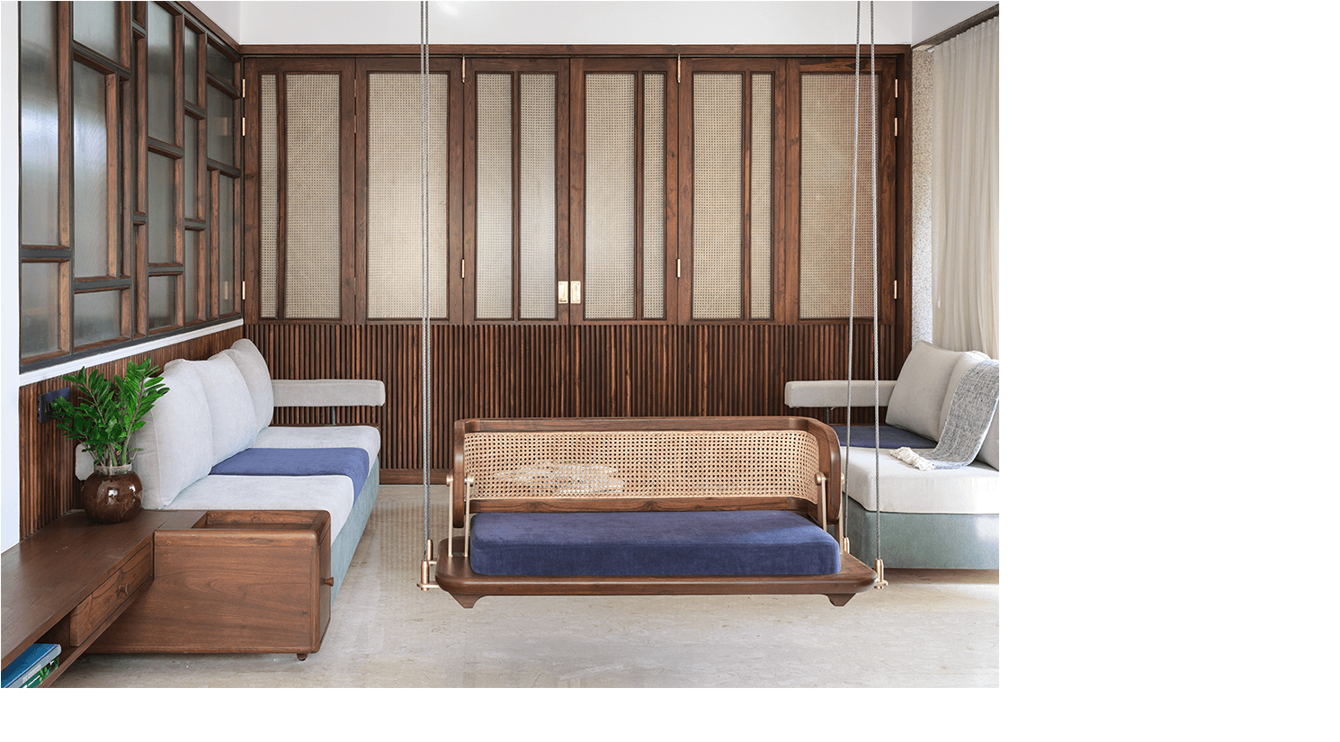
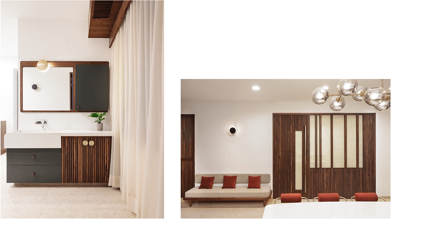
Initially, we insisted on a drawing room and a shuttered off living room for privacy which turned out to be a large living room. This created a small passage of space once you enter the house, for this, we created large sliding-folding doors which could be shut only if the space needed to be enclosed. We created a space that could accommodate a gathering of 15-18 people. All the furniture was designed in-house and not one piece was bought. The swing was designed in a way that if more people needed to be accommodated it could be un-hung and it would become a low divan.We used materials that were rooted and yet gave character to the space. Also, functionally, we needed to get light from the living room to the dining and maintain visual privacy. We used cane in-fill shutters for the same and a partition in fluted glass to separate the living room and the dining area.The centre table in stone was inspired from the Death star and our love for star wars. We made a pattern for the table top using different varieties of marble.


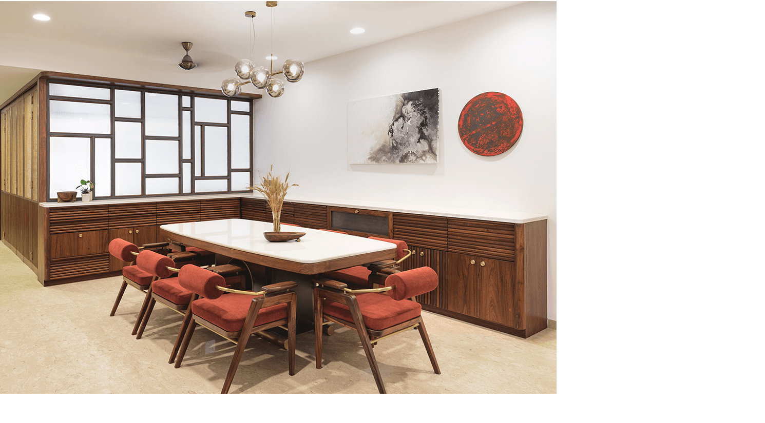
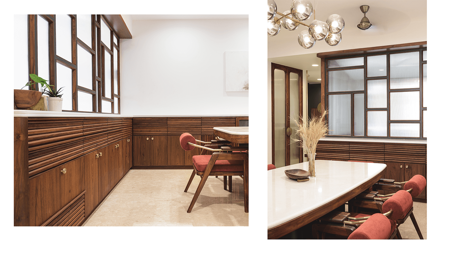
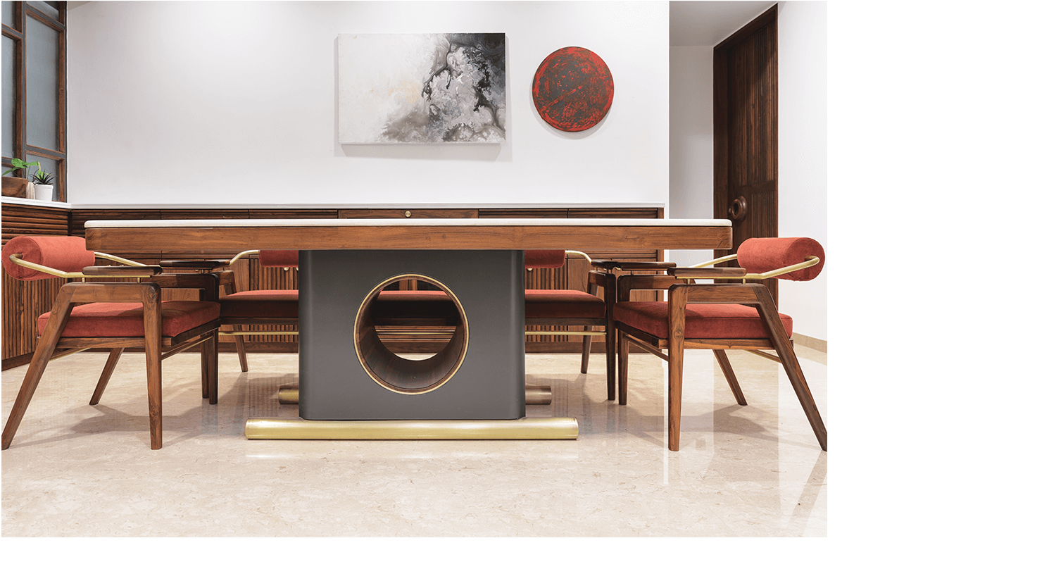
In the existing structure, the dining area had a large area for hand wash which we found to be a waste of space. We bricked up and used the inner space for a walk-in dressing for another room.The dining area had the requirement of having a lot of volume for storage for extra cutlery, “Nasta-Athana” etc that all Gujju households stack. The living room partition till 3 feet height became part storage and a platform which continued to the adjacent wall.Happy mothers are the one’s who get enough storage to feed the family well! The rest of the space was kept minimal. An unused and a large corner was used for hand wash and extra storage. We decided not to have a basin and create the basin and the counter out of terrazzo on site.The clients insisted on a closed kitchen. We incorporated a small but a cozy bench for the mother around the dining table to satisfy her daily dose of gossip. We wanted to avoid legs for the dining tables and the clients insisted that we do something new from what we have done till now. The design was done for the site. A large cantilever in wood and stone with a small base and brass supports. We wanted this to be a sculptural insert in the space.It also had to continue the story of circles we had improvised from the entrance door of the house. An element that you can reiterate in various form, shapes and functions.

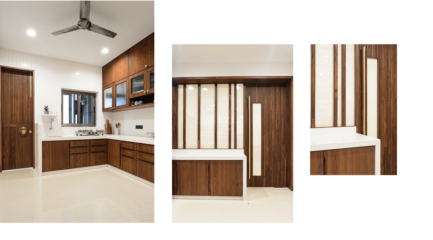
In a world of modular kitchens, we have always insisted to the clients that they let us do the kitchen designs. 1. They save on some money (who’s going to pay the architects extra to design and detail the kitchen, it was a part of the fees!) 2. It gives us more control to understand the user habits and design accordingly. For the Kitchen, because of Vastu constraints, the Cooking corner, the wash and the Drinking water had to be in one corner. The other constraint was that the client being of a short stature, we had to design the platforms and the upper units to a certain custom height.We had to already shut the kitchen from the dining, and because of vastu the basic logic of a kitchen that we are taught in schools was getting redundant.We realised that we couldn’t challenge the belief of a generation and decided to design a very neat kitchen.The storage room that was closed before was opened up and this gave us an extra counter that could be used for parties/communal cooking.The material palette was kept very simple, wood and terrazzo. The relevance of the fluted glass from the living to the dining was continued to the kitchen shutters. The handles for the shutters were custom made. A completely customized kitchen according to the user habits and functions and proudly “non-modular”. We also understood the tertiary service areas like the chokdi and detailed it according to vastu and the upgrades that the clients wanted.

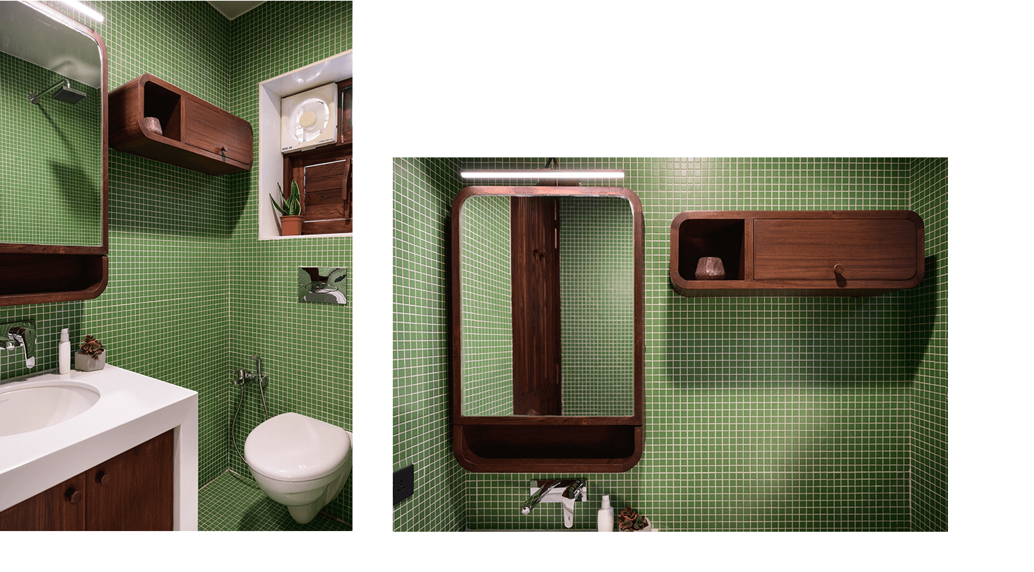
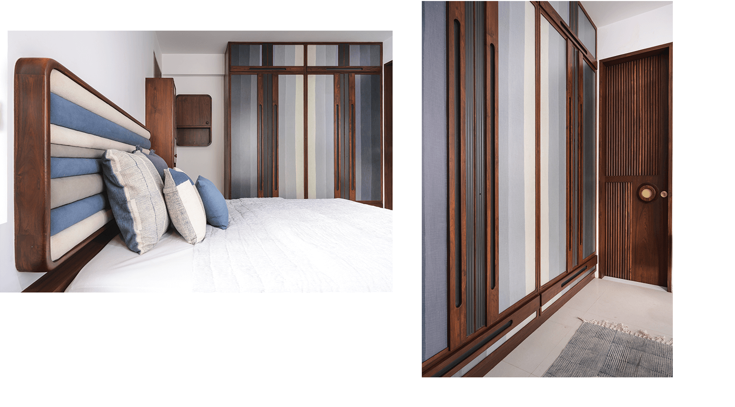
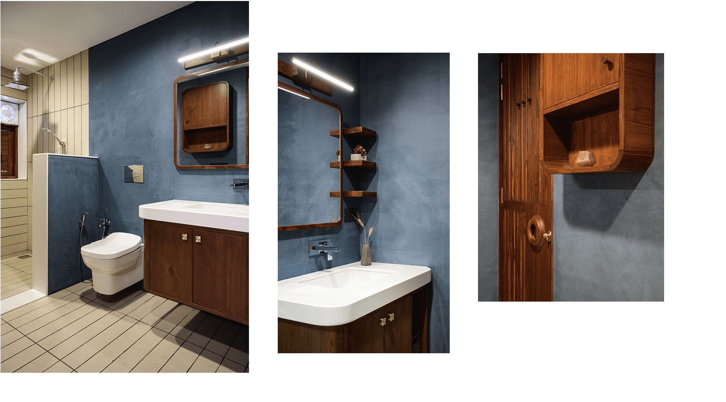
We made sure that a lot of the functions were taken care of in the furniture since the room sizes were compact. This also enabled us to not have generic side tables. The side tables or platforms became a space for other storage units and gave us the freedom to go vertical the avoid the monotony of a “Bed and side tables”. A Mirror and a dressing unit was incorporated in the TV unit space with a small space to relax and converse.We added extra storage in the bathrooms for toiletries etc. The material palette of the bathroom was kept simple to maintain the minimal material palette for the project. Lime plaster was used in the bathrooms to avoid joints and overdone details for the bathrooms and to complement a simple 2’ x 5’ handmade tile. We had decided that at a point we will convince the clients to focus on the fabric and textiles as these would get a very minimal material palette for the whole house together. We roped in Brinda of Abstrac textiles to customize all the textiles needed for the rooms. We paid attention to the hues and colours that would define each room and create patterns and textures to enhance the work that we were doing. This room in particular was to be defined by the textiles. It was an experiment as to how a good collaboration could add so much to a project. We decided on indigo as the theme. The fabrics for the cupboard fronts were custom dyed to size and specifications. These were matched to the fabrics for the bed back and the cushions, mattresses, pillows and the bed sheets subsequently. In all the wood work details and the fabrics came together to define the character of this room.


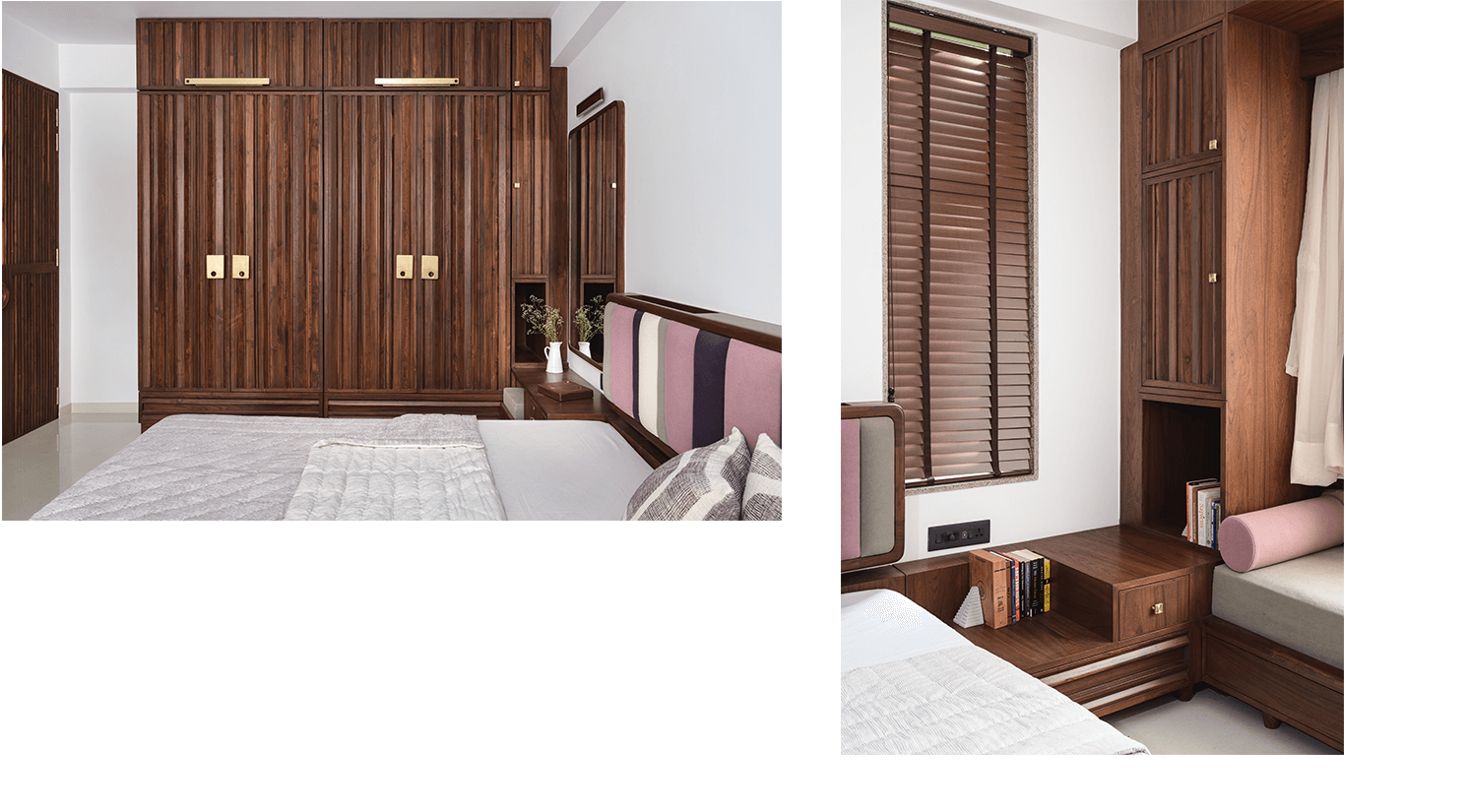
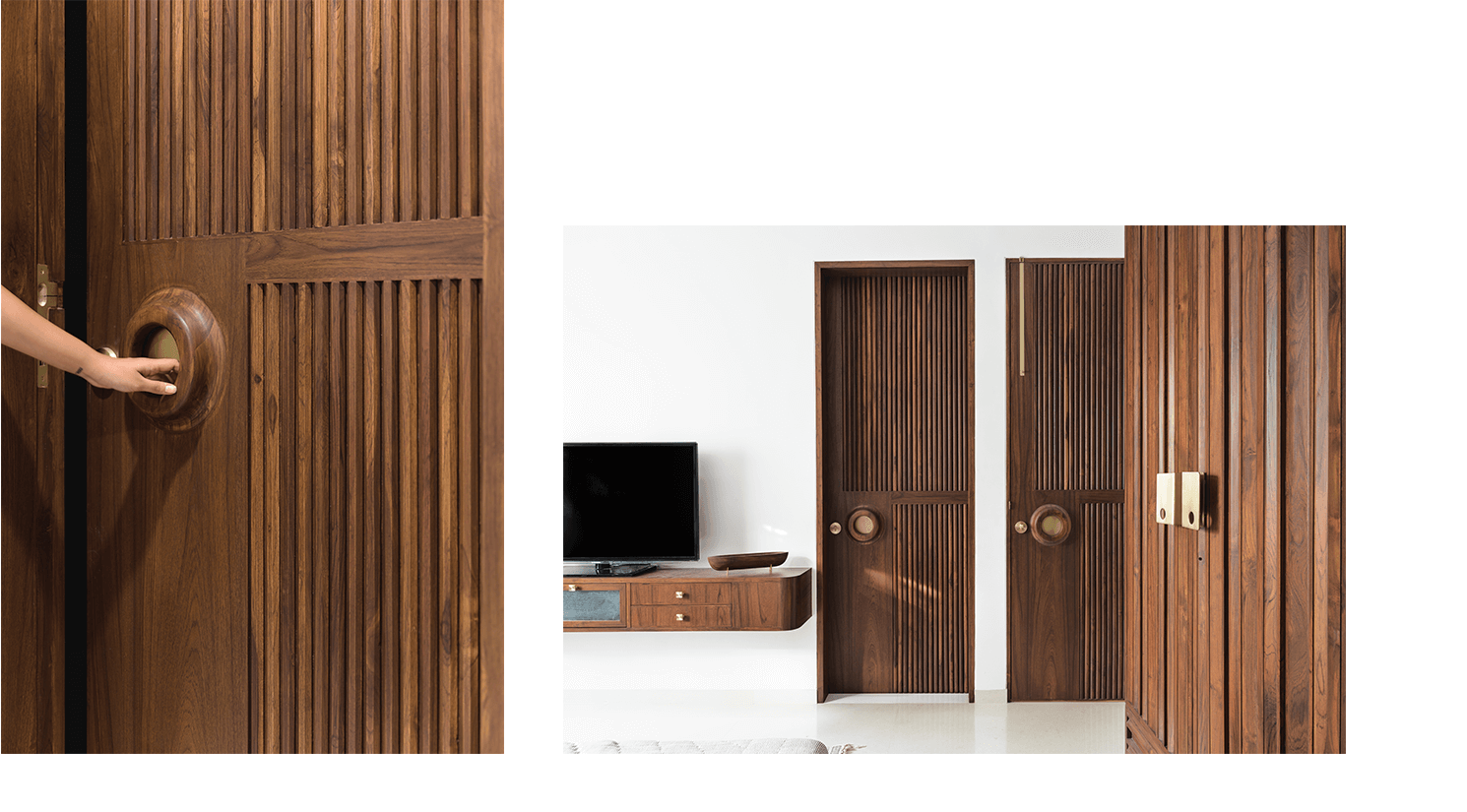
The brief for the parents’ room was to accommodate as much storage as possible. The relationship of clean design and maximum storage have not always been very good. We realized that we will need larger volumes to solve this. The question was how do we break up large volumes which are essential to create storage. An intern came up with an idea that he will design 5-6 sections in wood and we will utilize these to break up the volumes. The whole room is designed in these sections with added nuances of brass inlays and custom-made brass handles. The brass handles with the circular cut-outs were designed to break the backdrop of the wooden sections with a contrasting element. This room also had the largest windows. We decided to have a nice sitting space for the Parents against this backdrop with storage under the seating. The bedside table on one side becomes a small dressing with an incorporated bench, the end of the cupboard became small closed storage for perfumes and dressing related items. The side table on the other side became vertical storage for everyday items. We defined the bathroom with an indigo lime plaster and custom cut beige terrazzo tiles. For the fabrics, we decided to go for something we had not done before, an earthy lilac and this actually subdued all the woodwork in the room.

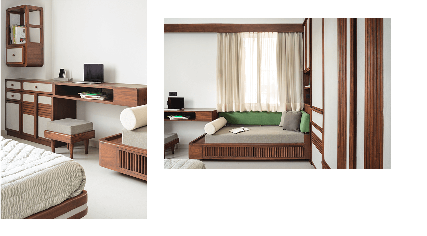
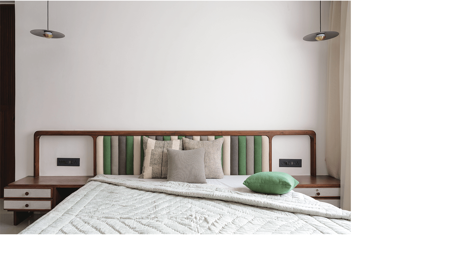
This room had gotten an extended space for the dressing as we converted the existing hand wash area from the dining to a walk-in wardrobe. For all the projects we do, we pay a lot of attention to the wardrobes, we sit with the client, make them count their sarees, dresses, shoes, watches, and belts and design the wardrobes accordingly. This room was for the younger child and we asked him he would want to open the whole cupboard to access his routine items. Based on this we created a pattern based on the functions and this actually became the backdrop for the room. We enhanced the cupboard-front with more lines and patterns and solid fills with grey lime plaster. The bed and the side table were envisioned as one unit and we extended the grey lime plaster in hints in the side tables. We decided on an earthy green with neutral fabrics to define this room. Along with the need for storage, we could add a small divan to relax in this room, with added-hidden storage with the unit.


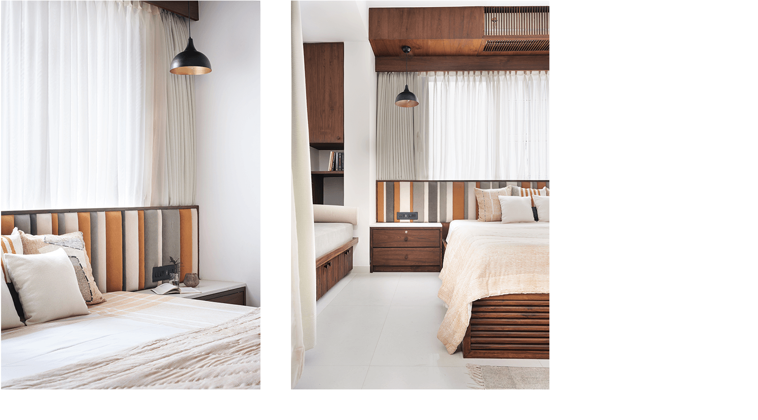
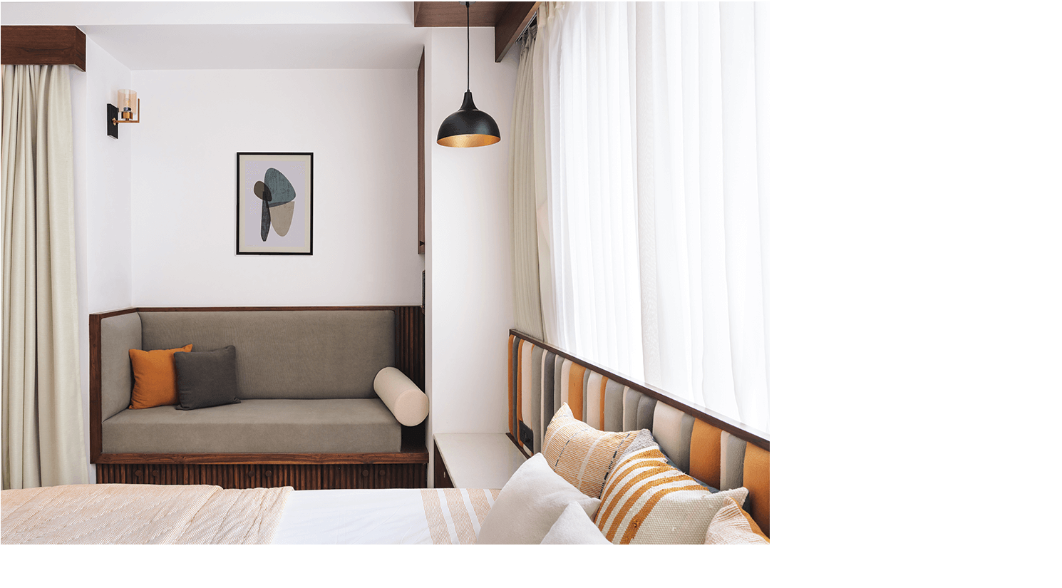
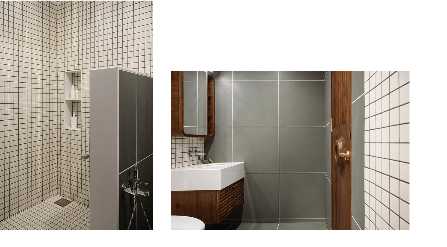
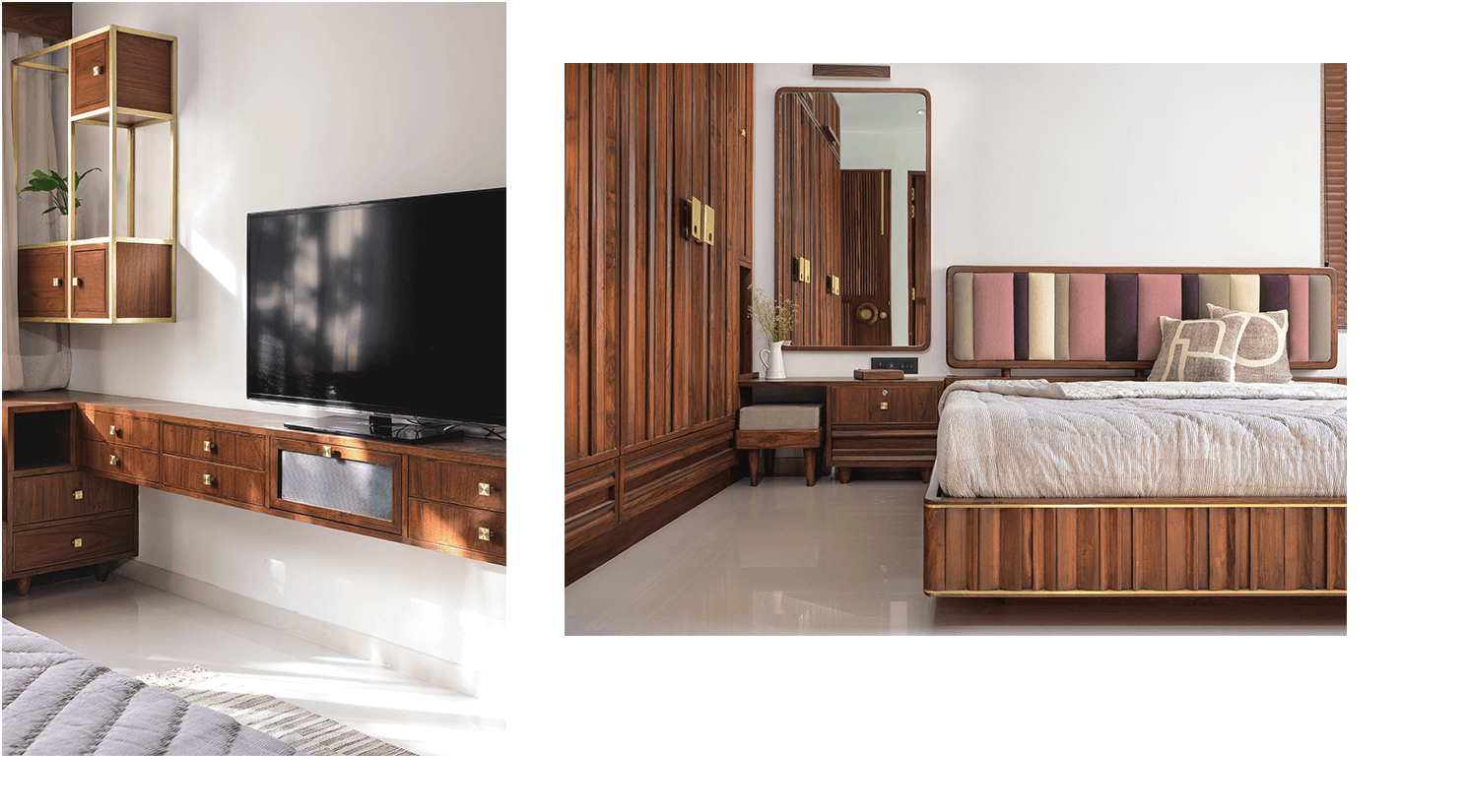
The guest room was always in disarray in terms of usage, in the client’s head. It became an office, then it became the mandir with extra storage and eventually, we decided on keeping it a proper extra bedroom but, with extra storage.To keep the room clean we used a bit of the kitchen store as an alcove for storage. We broke down walls to find that the builder had wasted 3’x 8’ of space for his elevation. This became a cozy corner with a small library in another unused space. The room, in the end, was an owner to a 70-inch television and contrary to it becoming a Mandir, an office space, a bedroom. It has become the clients; “corona den” A turmeric yellow was decided as a fabric tone to define this room. We extended the backboard of the bed to add a horizontal element to the backdrop of the bed as the head had to be in this position because of Vastu, even though the large window would be there. The bathroom was kept simple. Beige handmade tiles and a Kota green custom cut tile.
