"O Lord I will sing your glory fearlessly, I will be fearless in singing your attributes, Oh, one without attributes"
- "Nirbhay Nirgun" (Fearless and Formless)
by Sant Kabir
How does one design a formless house? This was the primary enquiry from which the conceptual foundation for the project was generated.
In the absence of a strong context, we were relying on the client's brief to inspire the design, but his complete disinterest in how the house would look from the outside prompted us to question the very basis of built-forms. This caused a shift in our perception that resulted in an inside-out approach to the design, wherein the experience of space from within took precedence over the external form.
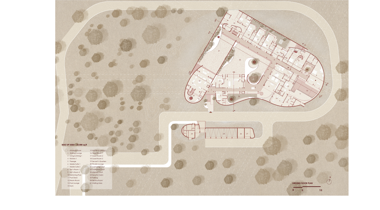
Along with the more practical concerns of scale and security and climate, this led us to imagine a second skin wrapped around the structure, holding the separate parts together and defining a series of courtyards that are intrinsic to the experience of the house. And so, it became a house without elevations, an inward-looking ”Enclosure".
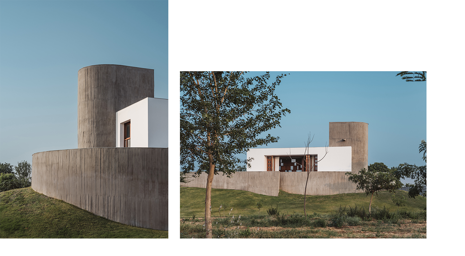

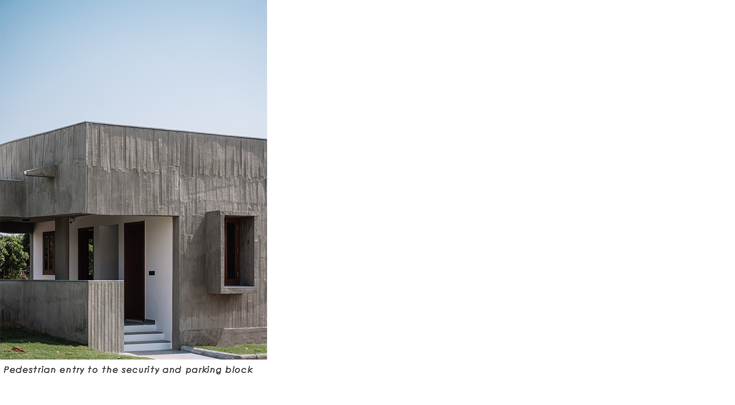
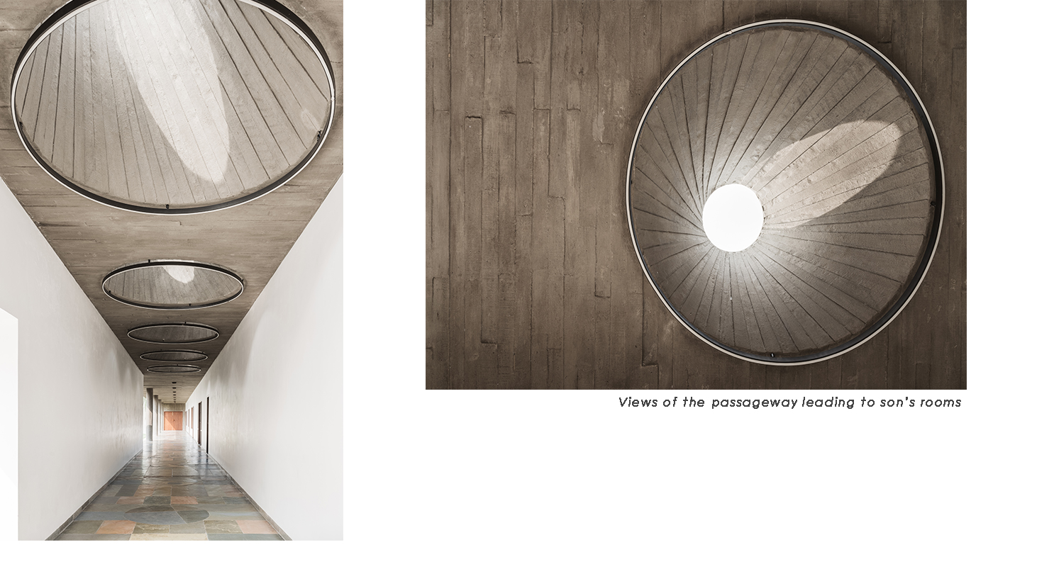
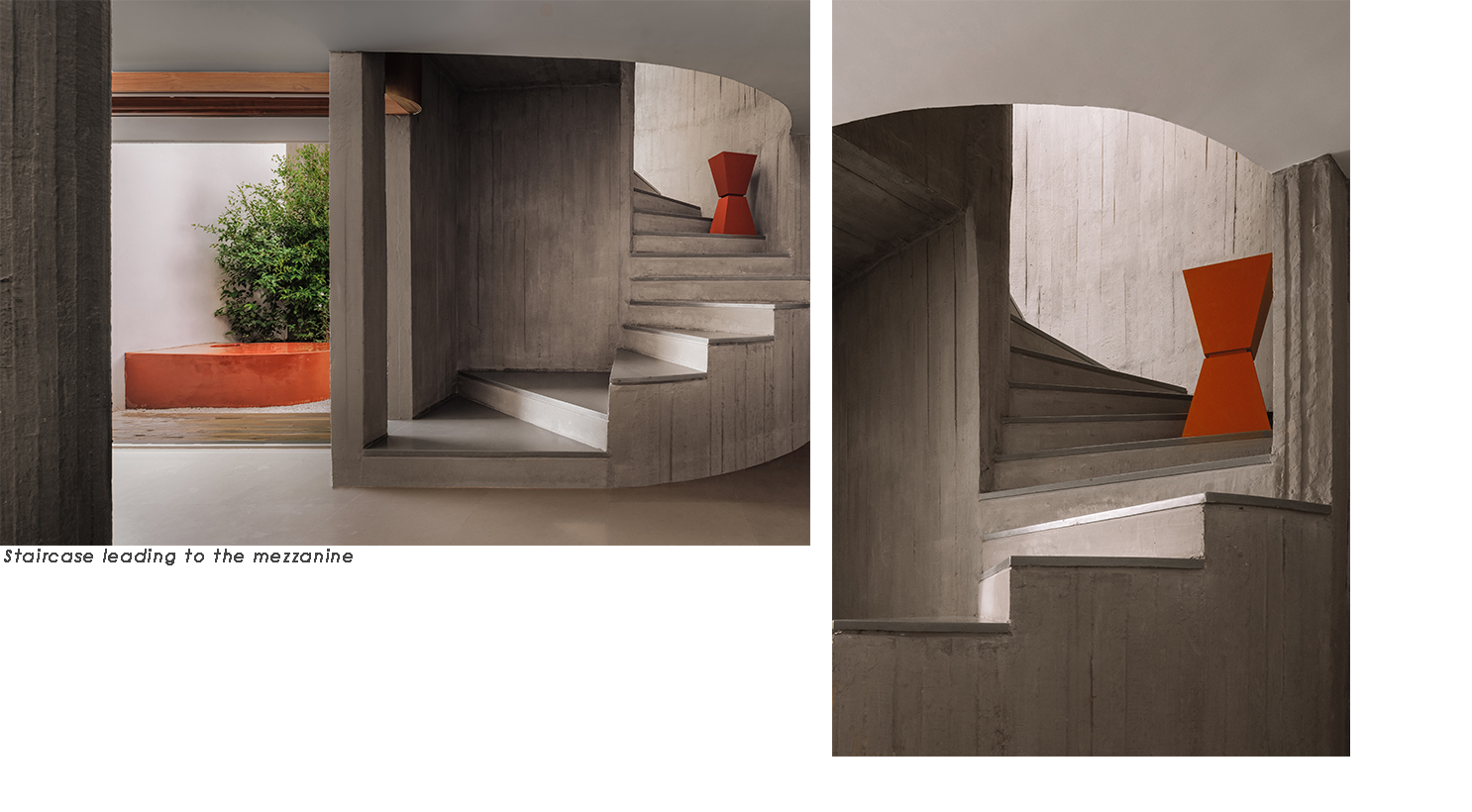
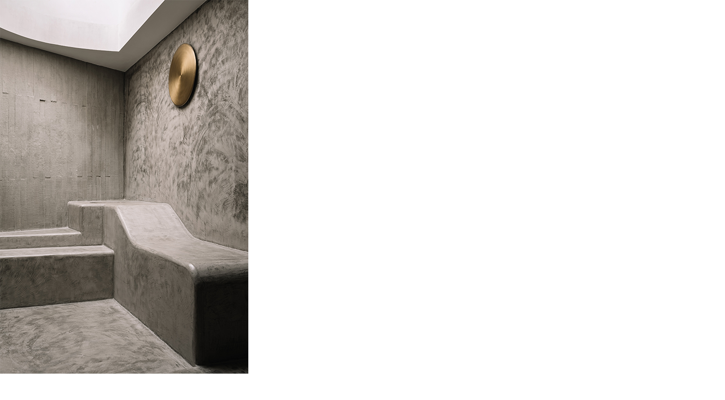
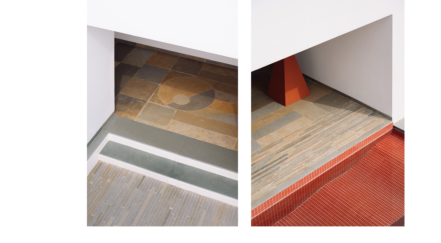
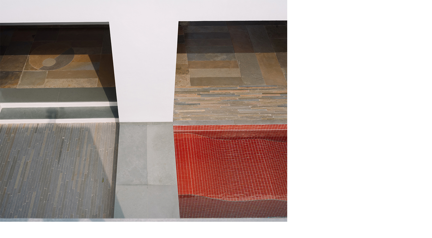
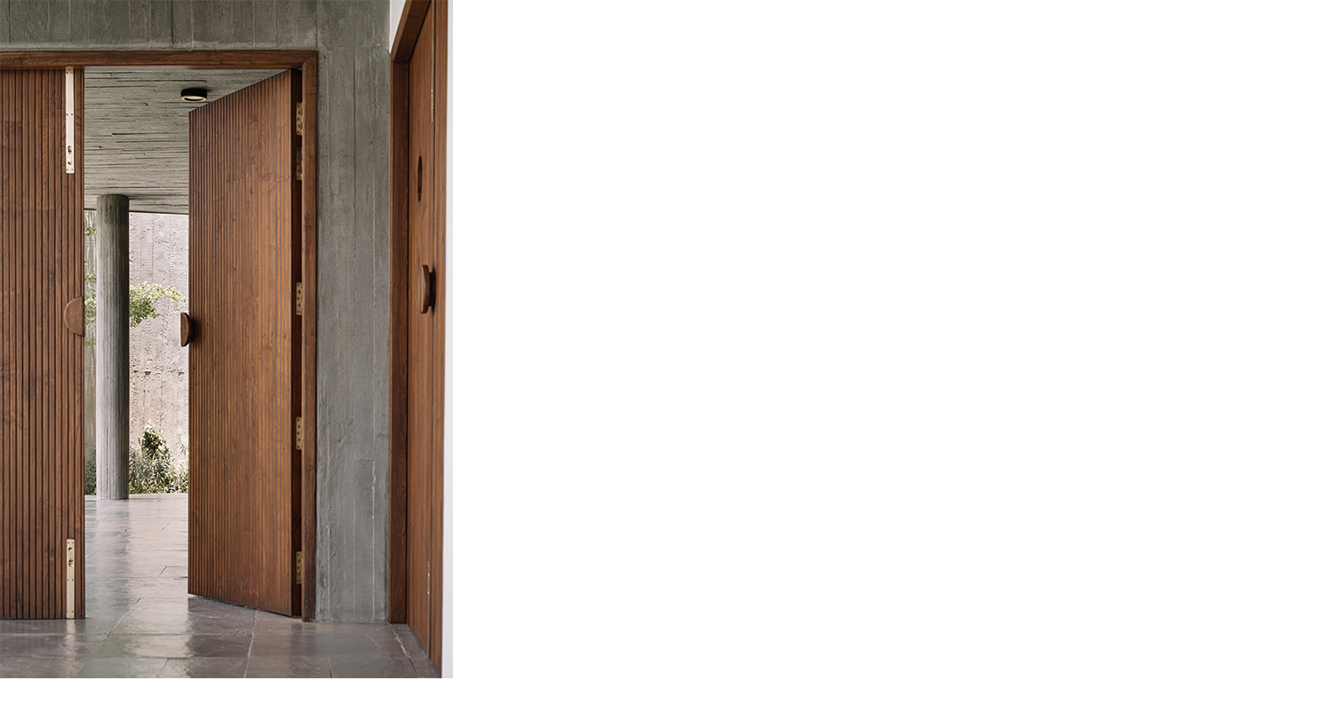
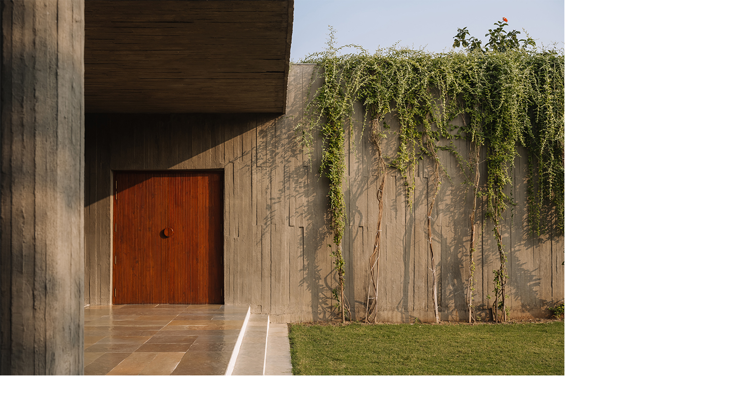
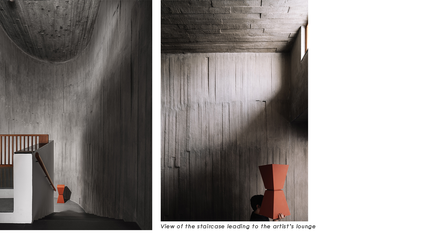
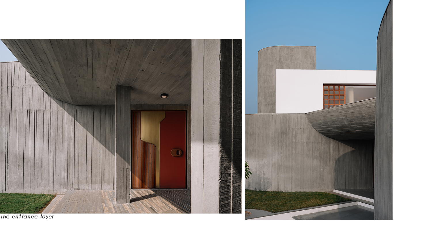
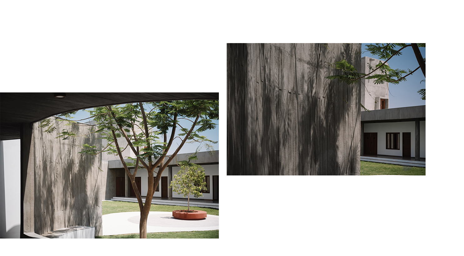
The materiality of the enclosure was the product of a parallel enquiry into the logistics of construction in a remote, rural location. Bringing a contractor from the city would be unfeasible for the budget and besides, the client, who himself had gone from being a farmer to a successful businessman now returning to his roots, insisted on employing local labour. As an experiment we asked a village contractor to build a sample wall in concrete, and the outcome: an unpredictable but beautiful texture caused by the shifting and warping of unbolted wooden formwork; was fascinating. We decided to embrace these "anticipated imperfections" as part of the construction process, even extending this choice to the use of other materials, the flooring in the corridors for example, which utilises strips of leftover stone from the interiors to mimic the pattern of the concrete walls.
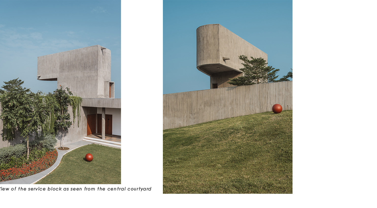
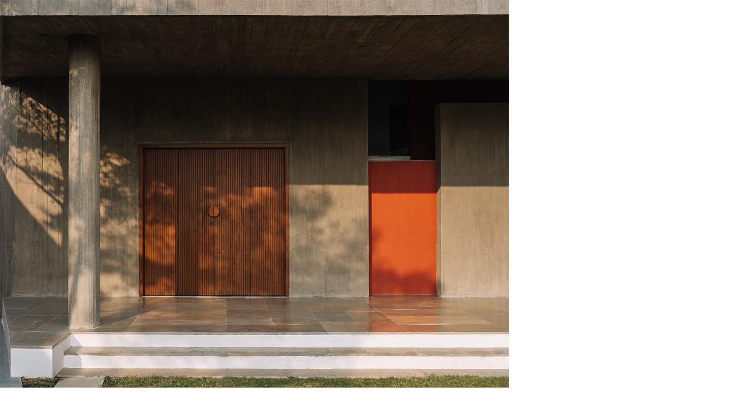
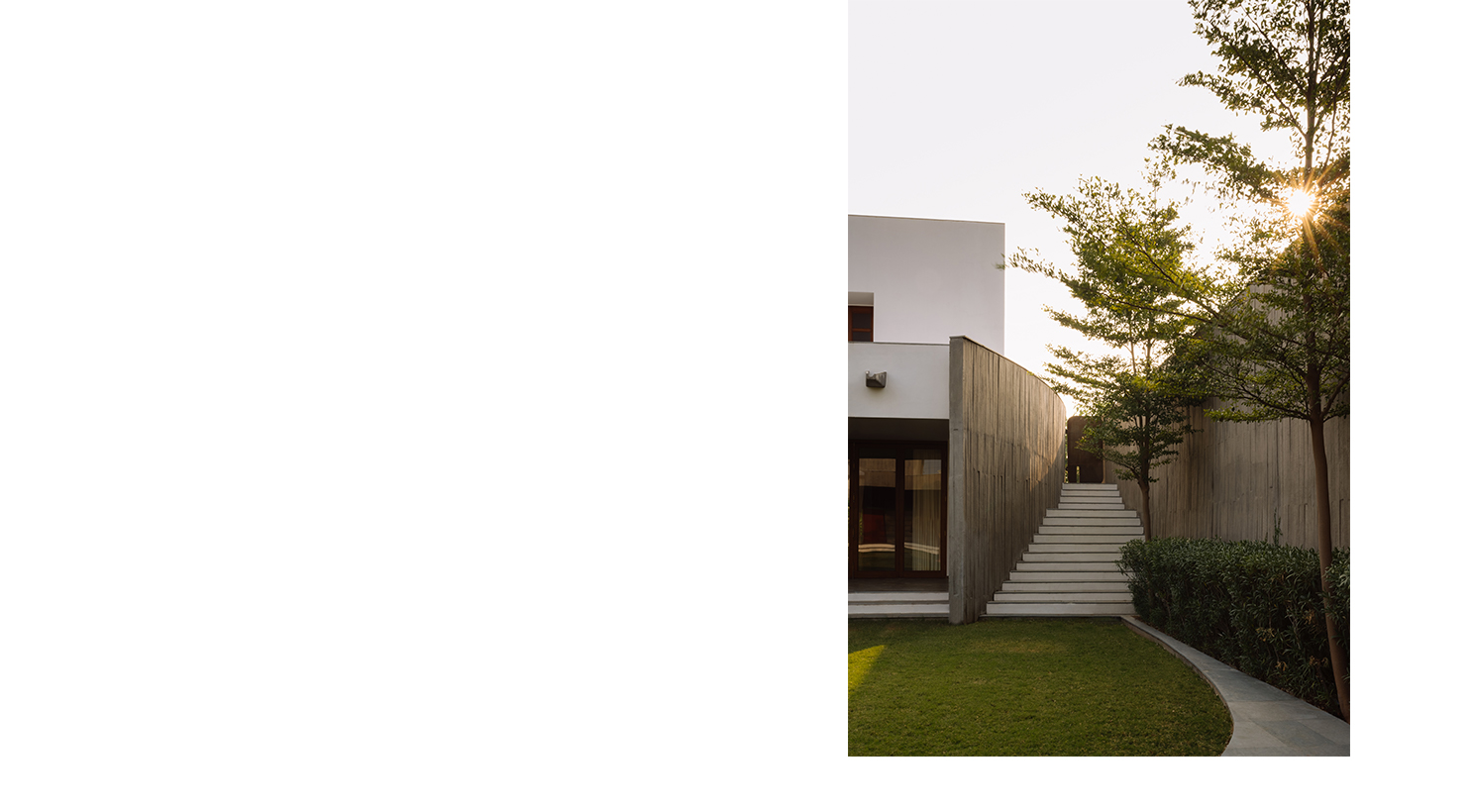
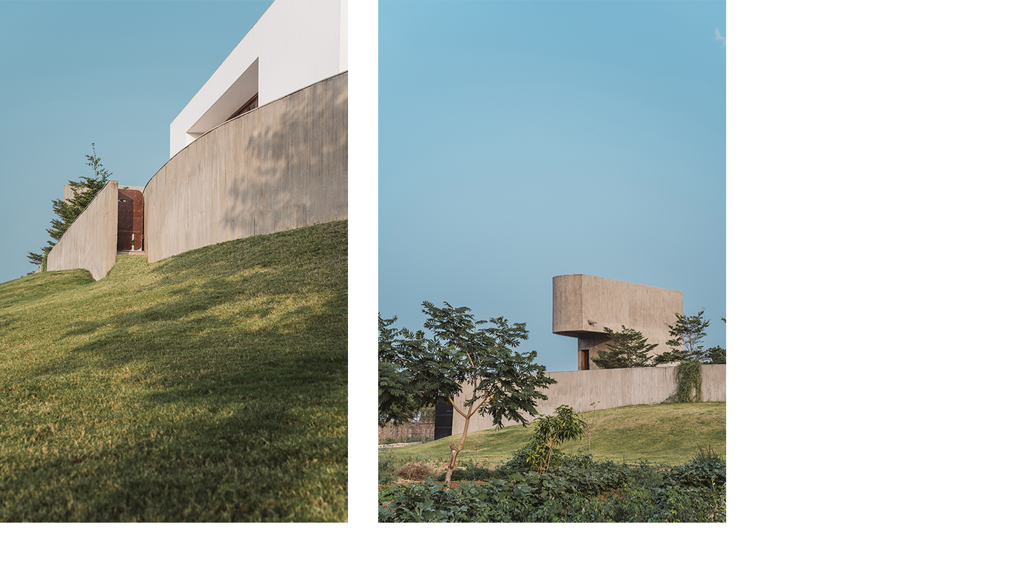
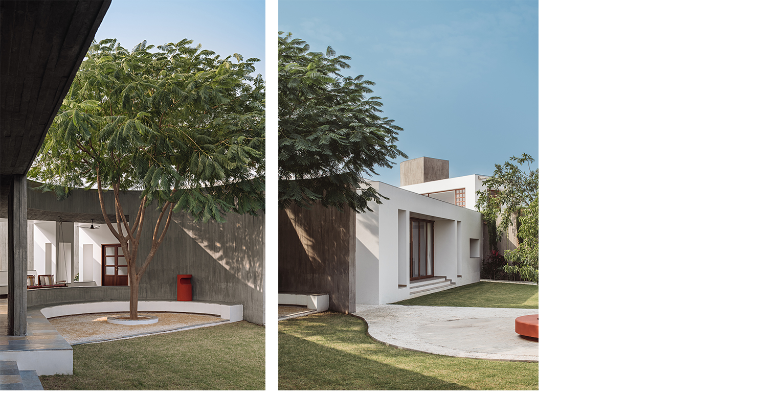
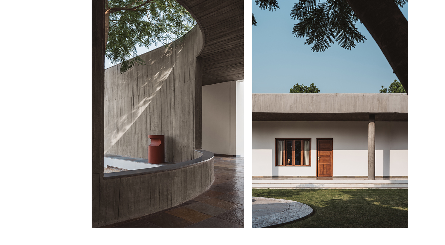
Situated on a mound, the citadel-like compound is bound by these peripheral walls, comprising of two curved and two straight surfaces, disjointed at their intersections to create points of entry or subtle exits into the adiacent landscape. Starting with a discreet entrance canopy where the two curved walls converge, this fluid, raw texture, by virtue of its contrast to the softer, white plastered walls of various rooms and the surrounding greenery, guides movement through the sequentially unfolding spaces of the house or frames deliberate places of pause. When the vegetation eventually grows over this backdrop of grey, the boundaries between inside and outside will further dissolve and diminish any notion of form.
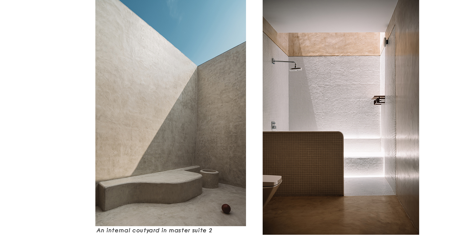
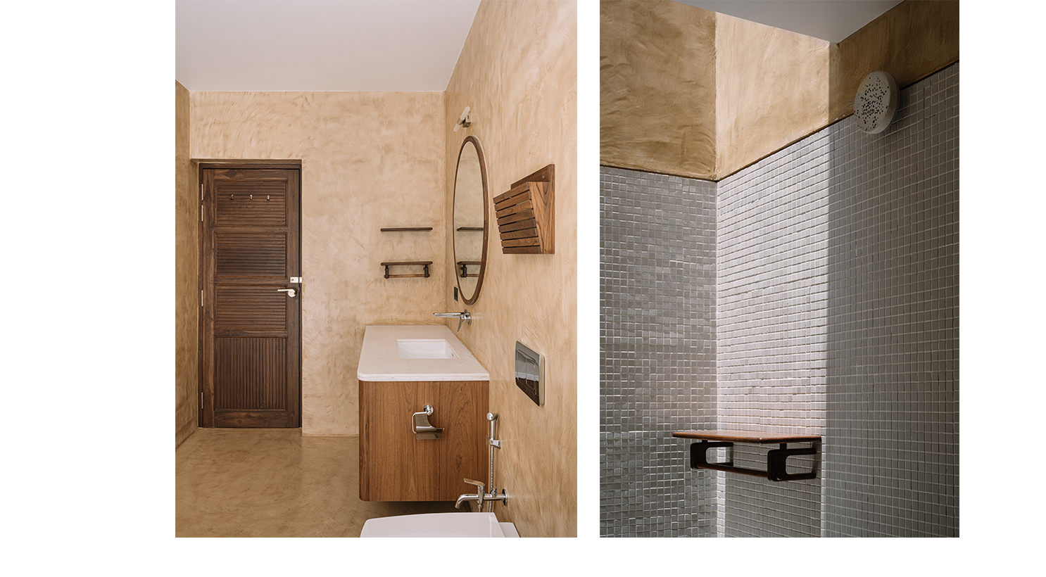
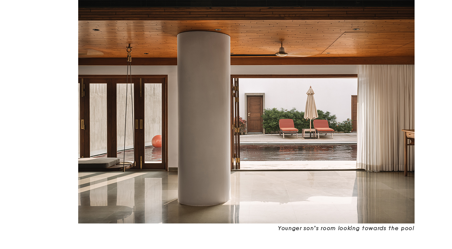
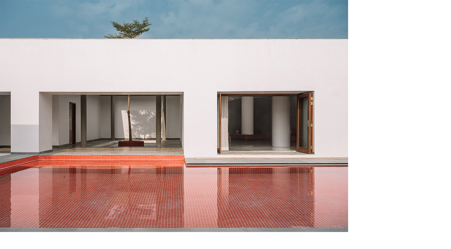
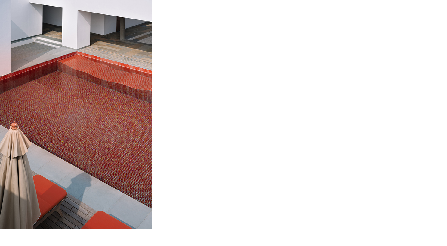
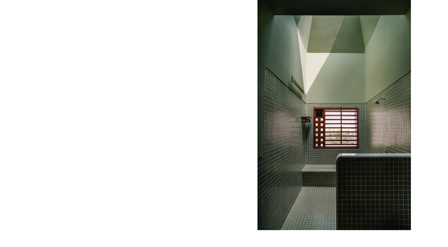
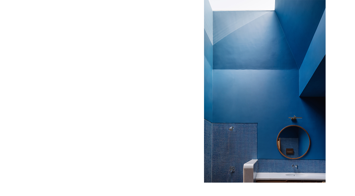
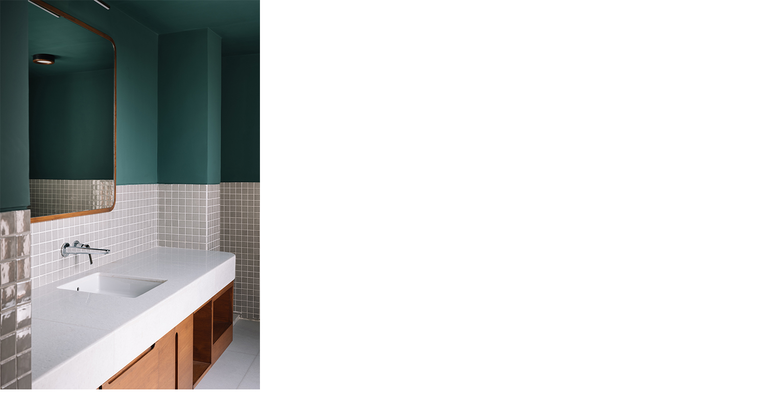
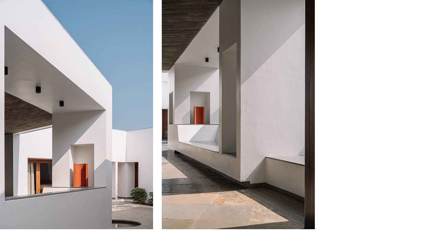
The muted material palette of concrete, discoloured kota stone, white and wood is occasionally punctuated by a warm terracotta tone: at the main entrance (where it forms the backdrop to a brass bindu, signifying the point of origin), in the swimming pool, on seats around seasonally flowering trees, and sculptural objects scattered throughout the house and garden. The only other use of colour is found in the most private spaces of the house, the bathrooms, with each being rendered in a different pastel shade and dramatically illuminated by turret-like skylights.


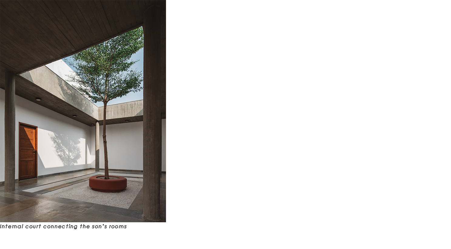
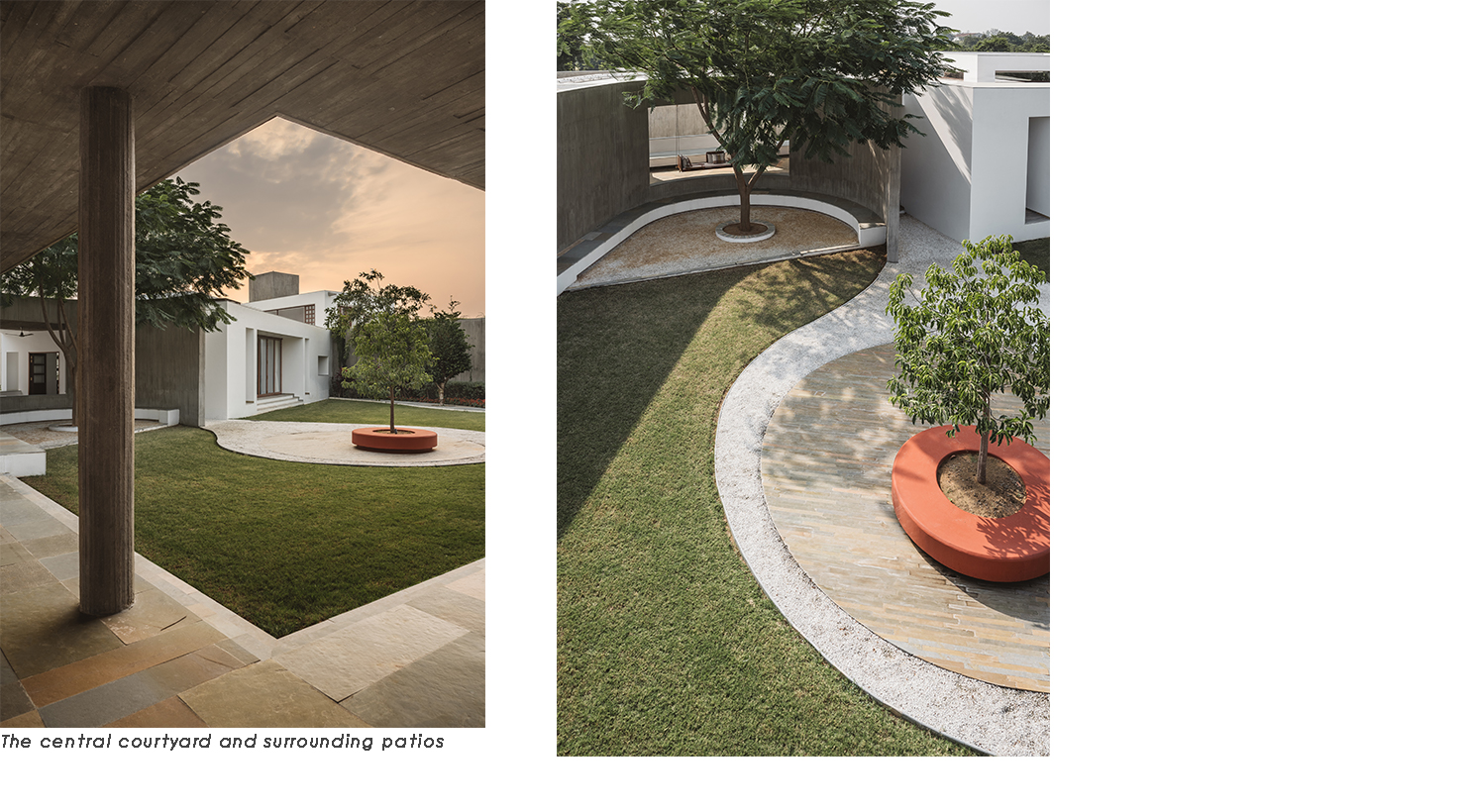
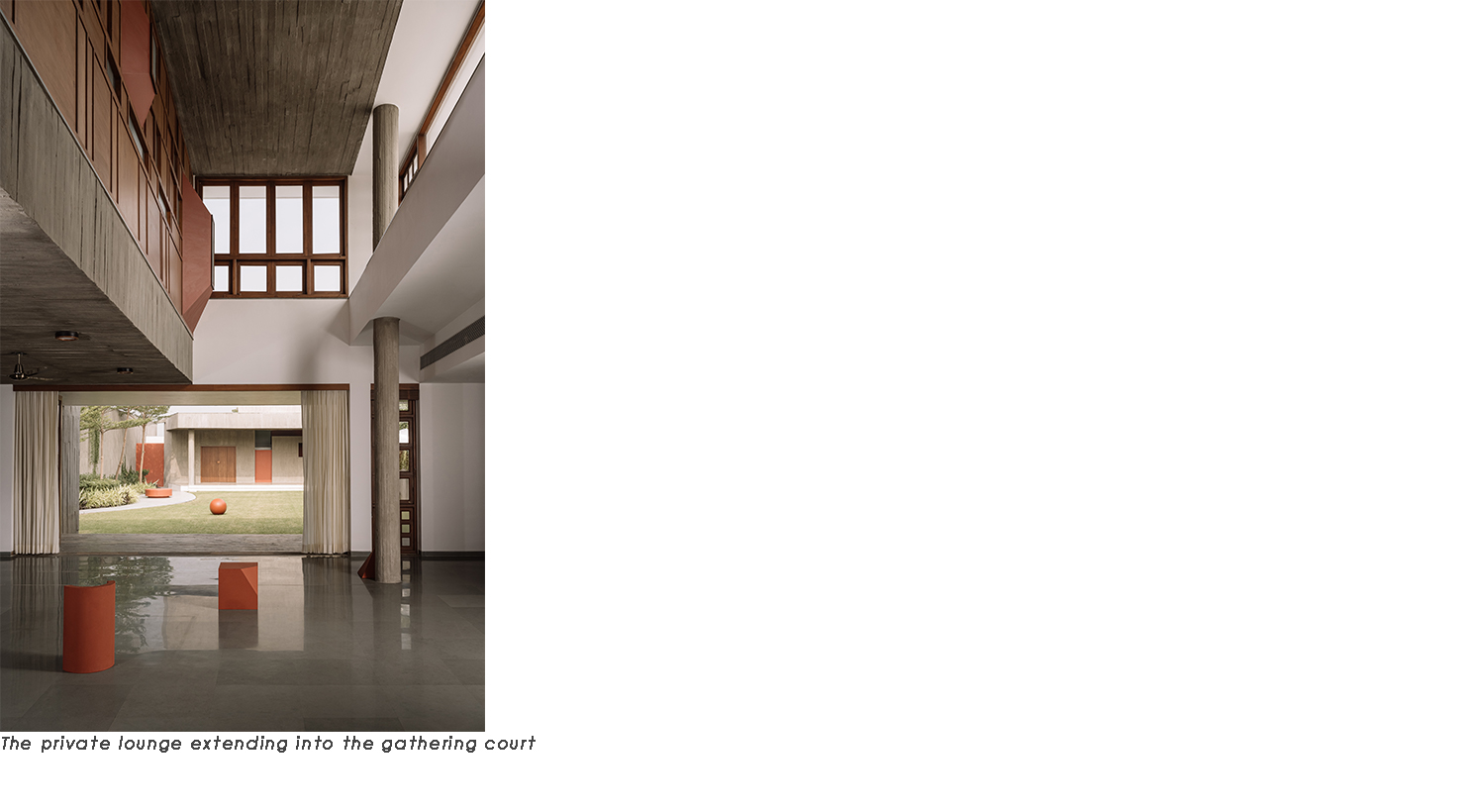
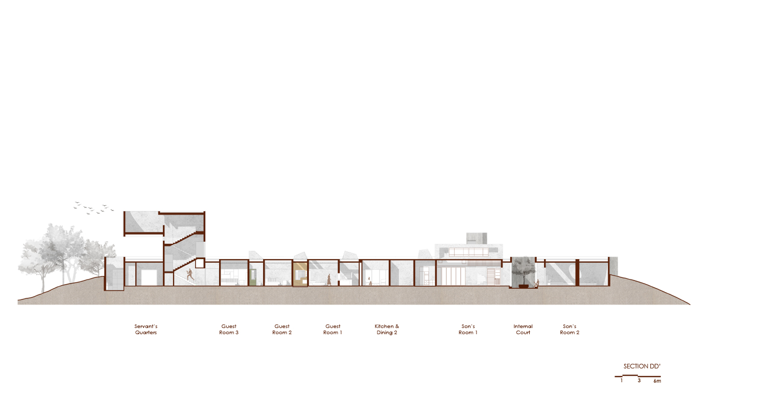
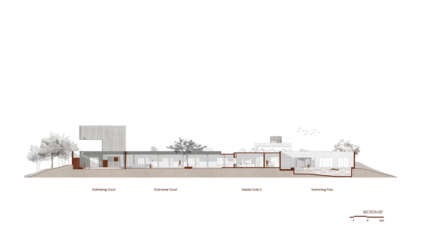
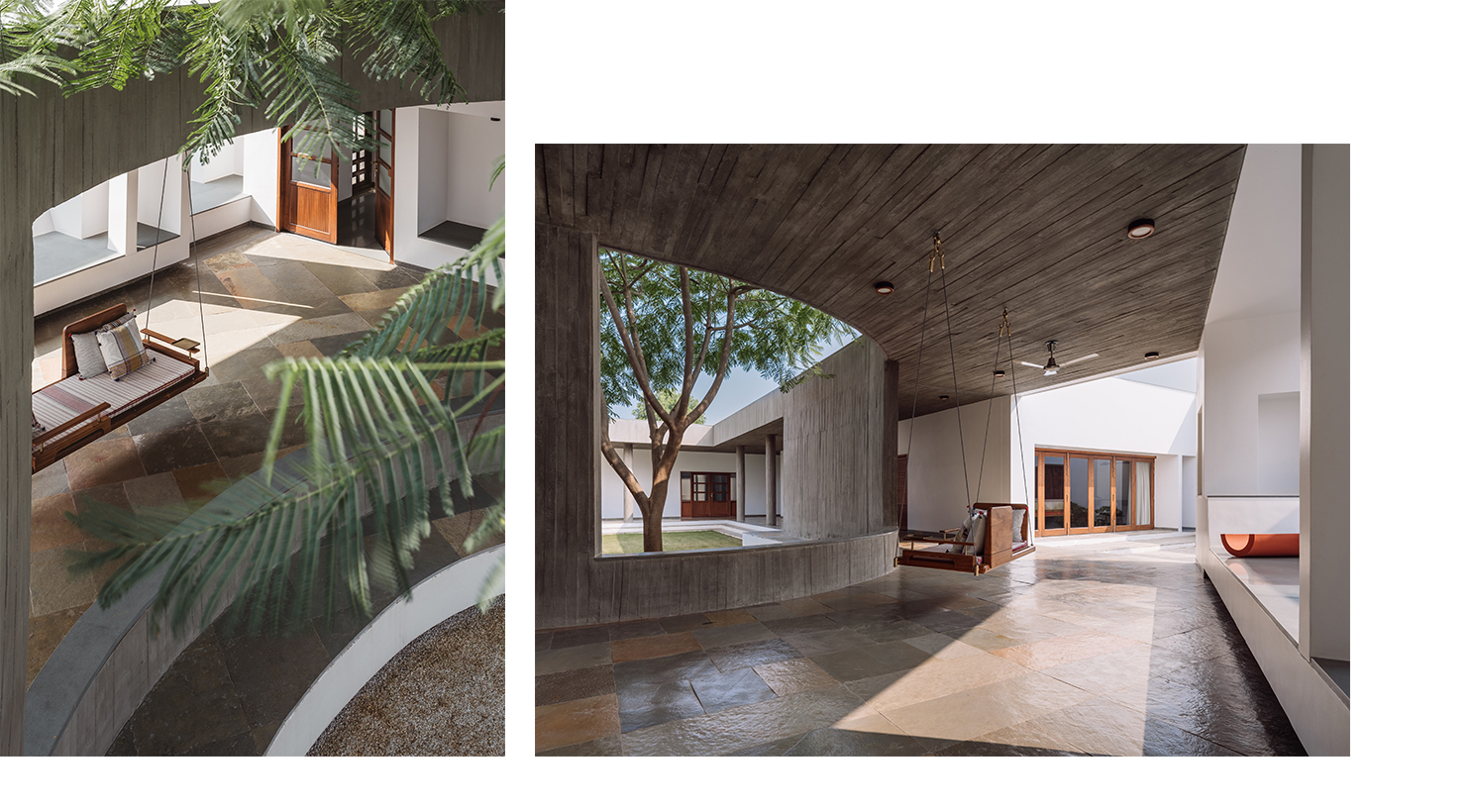
The planning of the footprint attempts to separate public, semi-private and private zones of the house, while still maintaining a continuity of flow around a central open space. All parts of the house open onto this courtyard, via a covered corridor, as well as onto smaller, private courts, ensuring that they get adequate light and ventilation while being protected from the harsh tropical sun and hot winds.
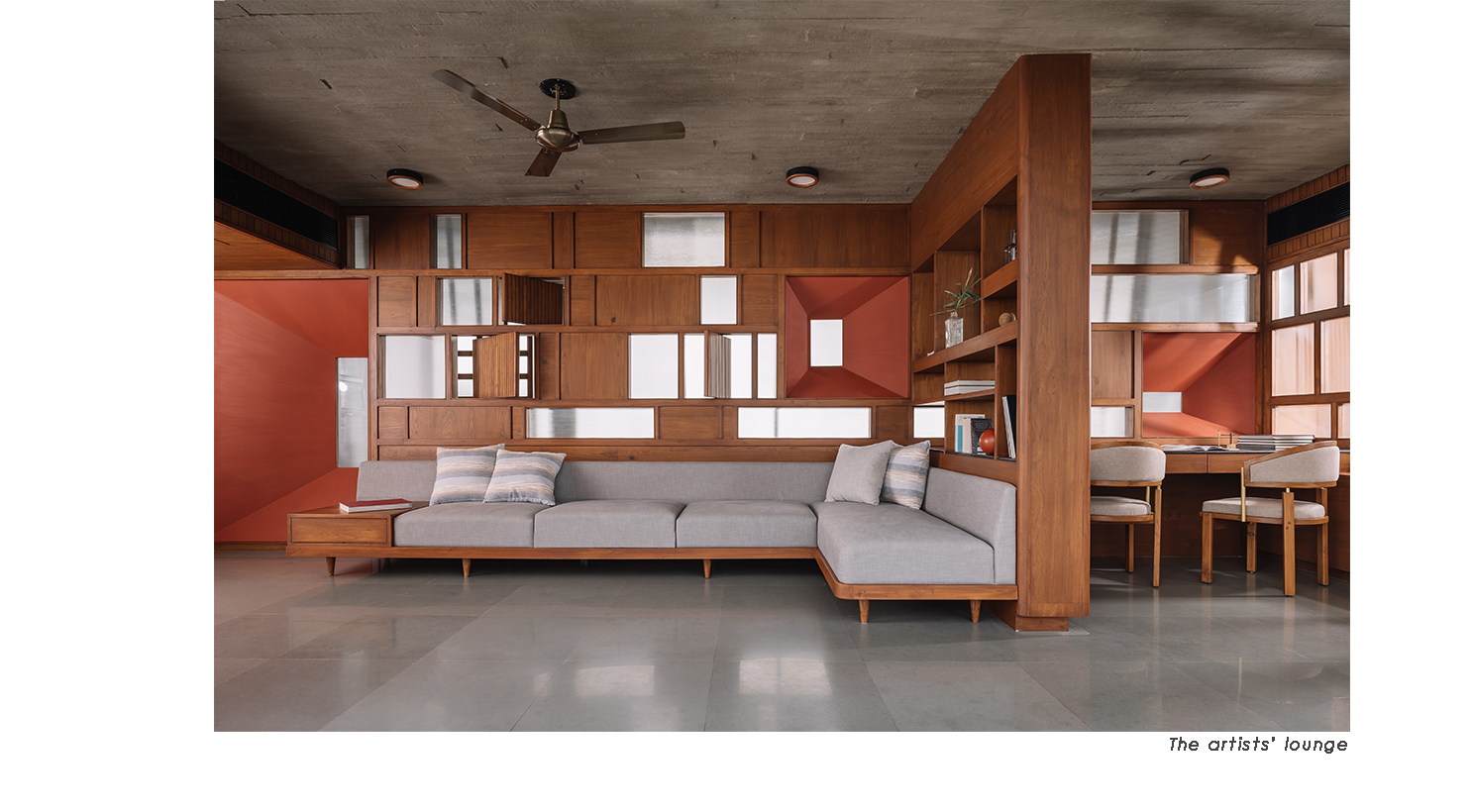
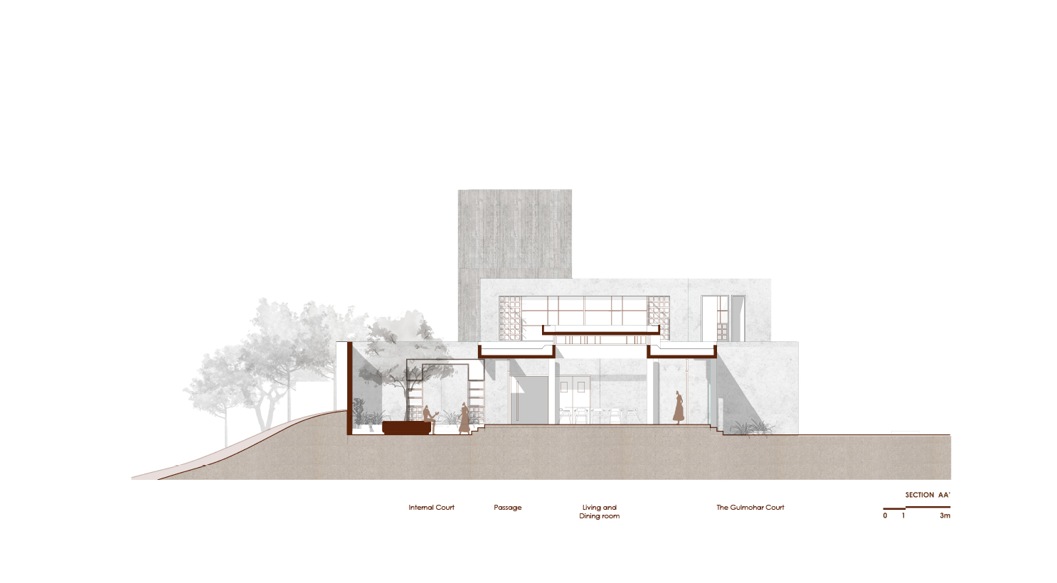
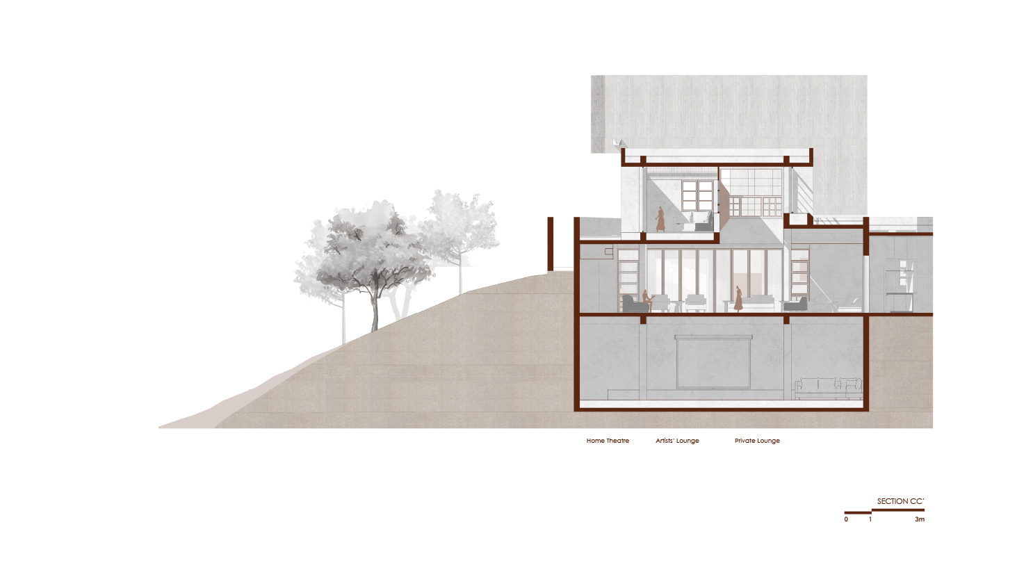
At the very entrance, casual visitors are directed to a formal lounge which opens onto a small, sculpturally dramatic court to the south and a sprawling lawn to the north that ends in a service area, making it conducive to host large events. Below the lounge is a basement with a home theatre, and above, a loft that lends itself to more intimate interactions with creative people.
Other guests are directed into the house via a waiting area where the mandir, a later addition to the design, is situated. Imagined as a floating cylinder, this object was the focus of many discussions with the structural engineer who wanted to pin it from above or anchor it to abutting walls, and yet we were quite sure that the weight of God could only be borne by Earth. This was eventually resolved by employing pile foundations, independent of the rest of the structure, to hold it.
Within the cylinder sits Shreenathji, not contained in an idol, but rather engraved into a slab of solid black granite, specifically selected to reflect His dark attributes, as though He had left an impression on it.
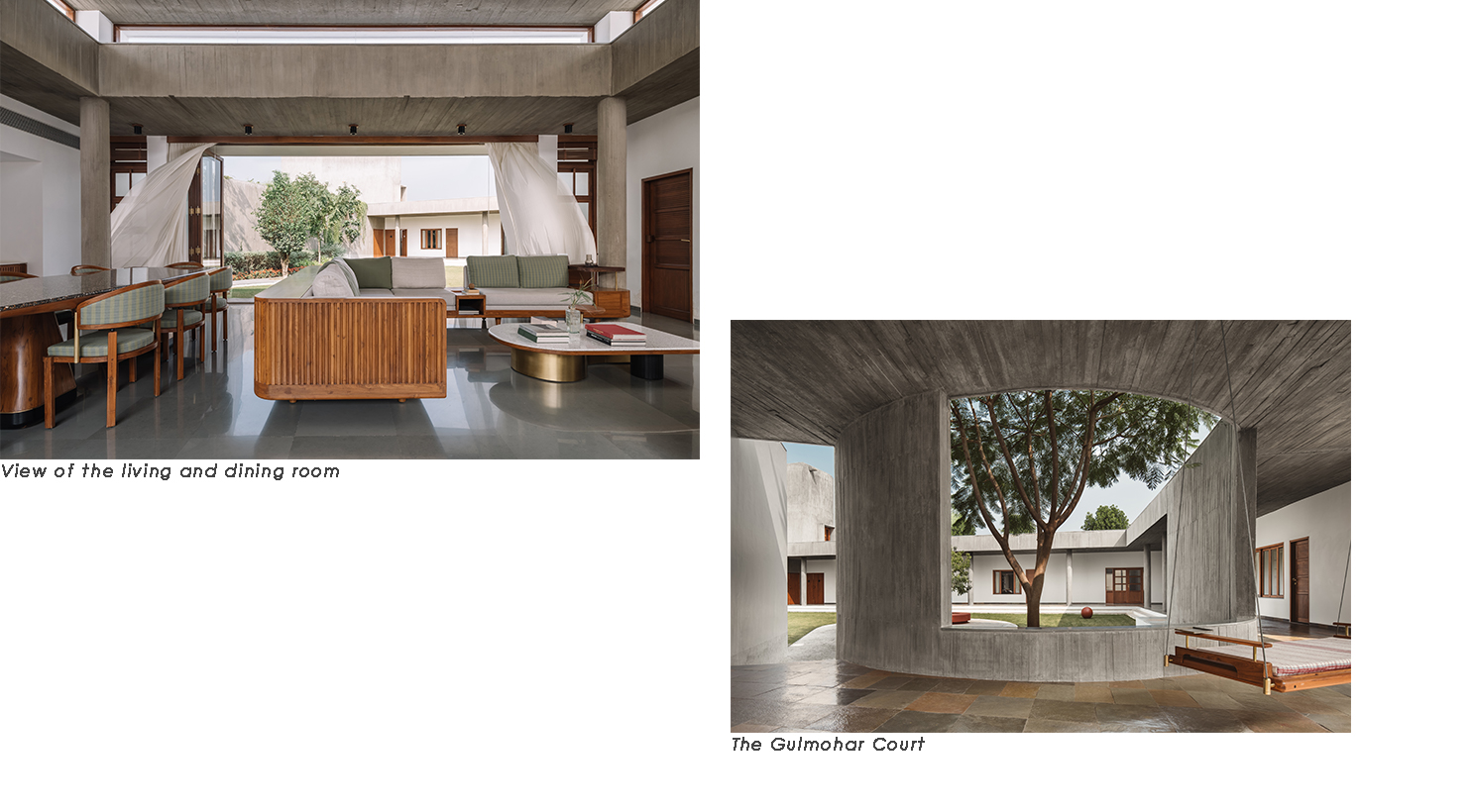
Across the passage from here is a hall that contains the dining and informal seating area, which in turn opens onto two courts, and is hinged to the visitors' lounge by the kitchen. Just beyond this the corridor widens, providing a place to pause at the very heart of the house, before proceeding to the more private areas.
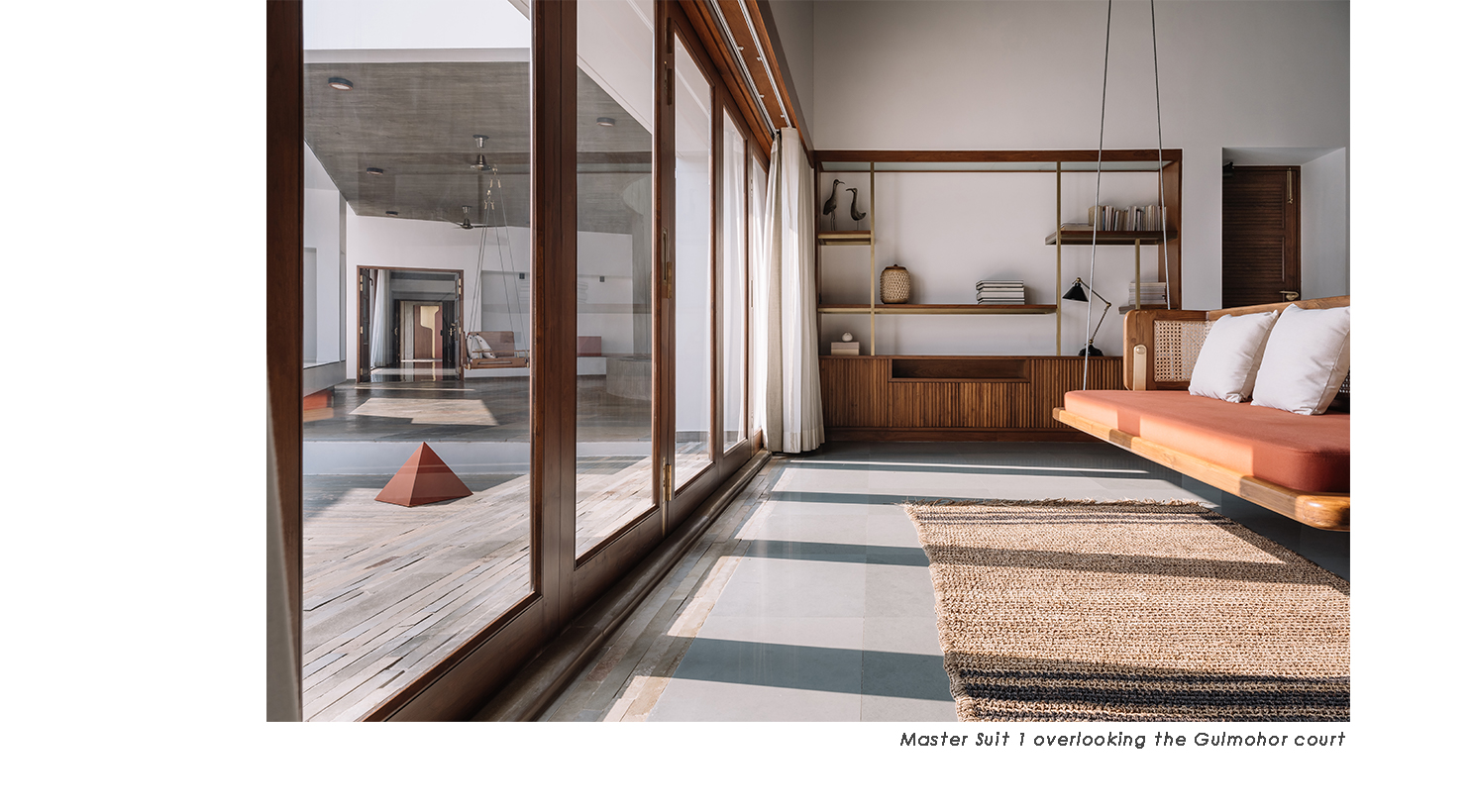
Defined by a third curved concrete wall that encircles and frames a gulmohar tree, and furnished with a large swing and built-in benches, this is perhaps the part of the house most favoured by the family.
Moving forward, the transition into the house is marked by a floating column, an ode to Roger Anger, the architect of Auroville, who often employed such elements as a means to create tension in his structures.
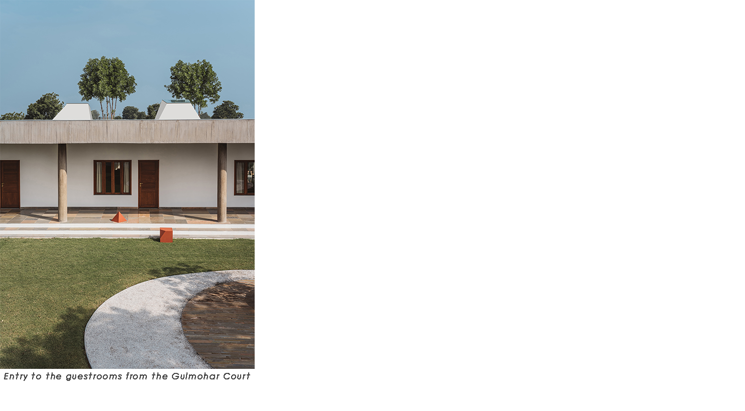
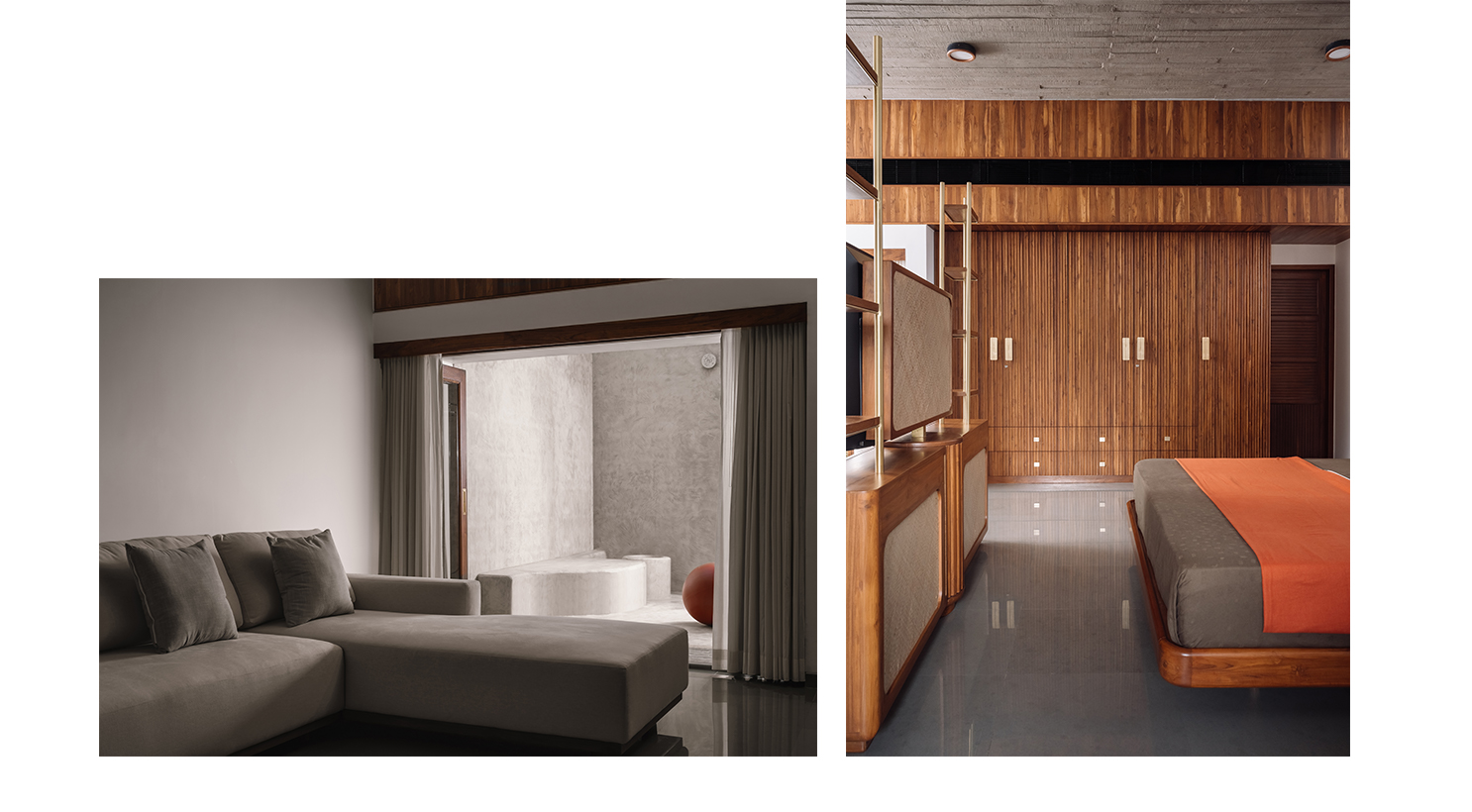
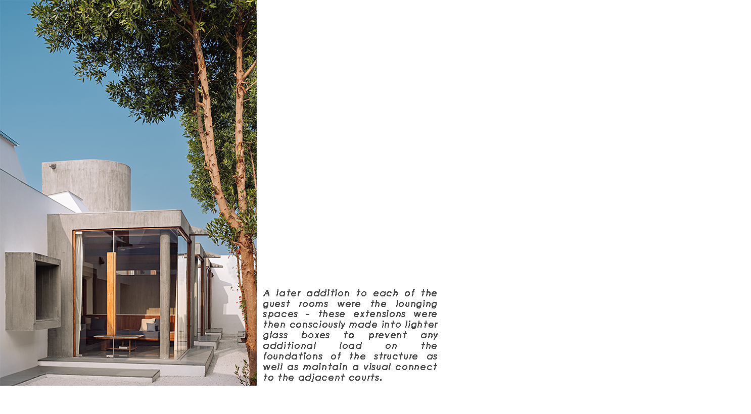
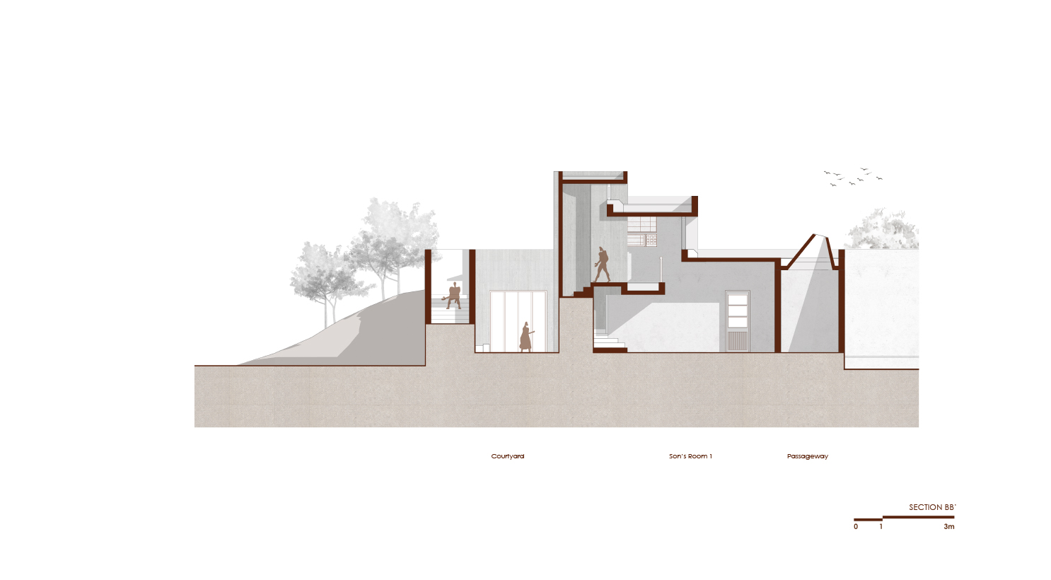
The passage then turns and traverses the eastern edge of the central court, leading to the family's quarters. A pair of rooms that comprise the master suite: a study that can be converted into an extra room for close friends and the clients' own bedroom with an attached bath and open shower; squared by another set of suites for their two sons, form a patio for the swimming pool and gym, secluding them from the rest of the house. Conical casements, supplemented by custom-fitted lights, create a dramatic play of shadows in the corridor that crosses between these blocks and culminates in another court that separates the sons' rooms: the elder's having a display for his collections and an attic for his son, while the younger's is characterised by a curved wall that marks the end of the structure. Separated from this area by a pantry kitchen and outdoor dining space, and forming the west wing of the house, are three guestrooms.

In many ways this project directed the trajectory of our studio during its formative years. Disrupted by several delays, including two lockdowns, the seven and half years it took to complete gave us the opportunity to repeatedly reassess our ideas of what architecture is, of what a design practise should be, and to delve deeper into these questions while still being able to detach from and discard concepts when required.
Whereas in the original scheme the mass of water tank alone rose above the line of the exterior walls, we were now confronted with the difficult decision of reviewing the plan, which had taken numerous iterations to perfect, or raising other volumes to accommodate the revised brief. We opted for the latter, lifting two more blocks to look beyond the walls: the artists' loft and the grandson's attic; and imagined them as three sentinels in conversation, floating above a seamless sea of green once the vegetation had reclaimed the concrete.
The idea for the loft itself was a serendipitous result of this delay. Drawings and models, scattered around our studio for years, occasioned tangential dialogues with various visitors: musicians, artists, designers, poets, writers, and of course, other architects; a process that we have actively integrated since then, to broaden the conversation around projects beyond tectonics.The client noticed this too, and recognising the merits of such exchanges, asked us to include a space where he could invite innovators to work.
As the project progressed, everything from architecture to interiors to landscape was addressed to develop a comprehensive design language, and all elements down to the smallest, including furniture and hardware and light fittings, were rigorously detailed and custom-made by our craftsmen. The project was truly a celebration of the act of creation, which has become for us the essence of our design practise.

A spiritual journey is an inquiry into one's own existence, or rather an inquiry into existence and non-existence and the relation between the two, culminating in the realisation of pure existence beyond inquiry. The journey we undertook with this project has been no different, and perhaps the most important learning has been one of self-negation. Already the champions of our beliefs, we now became their greatest critics as well, and in the margin that reconciles all opposites we discovered something truly original, the very source of inspiration. There is a flow, we found, a constant and rapid impermanence, and that if we let go of everything we know and every desired outcome, it would carry us to places we could never have imagined. This is what brings richness and newness to our process.
The relation we have developed with this house causes us to return regularly to it: to add art and artifacts, or to check on the trees, or just to see the family living in the environment we built for them. The client is now seventy years old, and has become like a godfather to us. His faith in us has been unshakable, and in return we have never denied him any request. Lately his wife has been asking us to design a spice box for her, and has promised that we will not be served a meal in their home until we do. This gives us something to look forward to, for while there is a need for closure, we secretly wish that our engagement with this project never ends.
